Popular WPC Wall Panel Colors in Hotel Interior Design
Popular WPC Wall Panel Colors in Hotel Interior Design
Introduction
Hotel interiors are more than just decorative backdrops—they are carefully designed spaces that set the tone for the guest experience. The right wall design can transform a hotel from a simple accommodation into a memorable destination. Over the past decade, Wood Plastic Composite (WPC) wall panels have emerged as a preferred material for the hospitality sector. Their eco-conscious composition, easy upkeep, and broad aesthetic range make them a natural fit for hotels aiming to balance functionality with style.
While durability and sustainability are clear advantages, color choice is equally influential in defining the character of hotel interiors. A single color palette can communicate warmth, elegance, or sophistication, depending on how it is applied. In this article, we will explore which shades of WPC wall panels are most frequently used in hotels, how they shape specific environments, and what global trends tell us about future color preferences.
Why WPC Panels Are a Smart Choice for Hotels
Before diving into colors, it is worth revisiting why so many hotels turn to WPC Wall Panels in the first place:
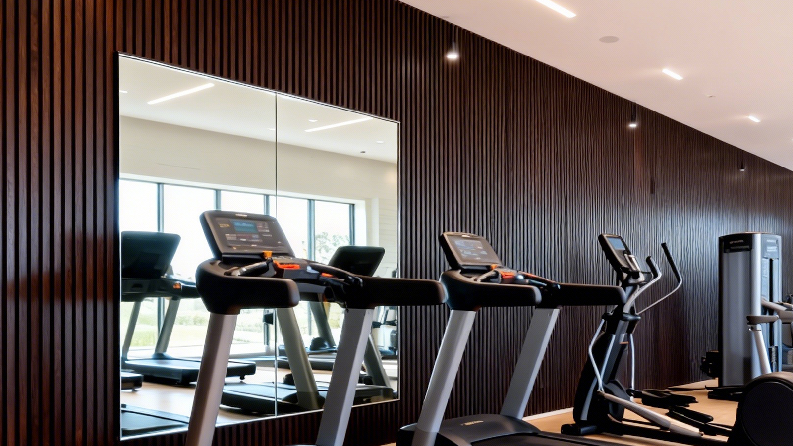
- Resilient in heavy use: Resistant to dents, scratches, and humidity, they are ideal for busy lobbies, corridors, and guest rooms.
- Sustainable production: Created from wood fibers and recycled polymers, they support green building initiatives.
- Design flexibility: Offered in diverse shades and textures, from soft neutrals to rich wood grains.
- Easy upkeep: Smooth surfaces make cleaning effortless, lowering long-term operational costs.
- Safety: Fire-retardant and water-resistant, ensuring safer interiors in hospitality environments.
These qualities make WPC wall panels more than just decorative—they are a practical design tool for enhancing both guest comfort and operational efficiency.
Color Selection in Hotel Interiors: Why It Matters
Psychological Impact
Colors affect mood and perception. Soft, warm hues help guests unwind, while cool or neutral tones bring calmness and balance. Hoteliers use specific palettes to match their branding—luxury hotels often lean toward darker shades, while boutique hotels favor lighter, airy colors.
Functional Use
Not every corner of a hotel demands the same atmosphere. Guest rooms require coziness, conference rooms need seriousness, and wellness spaces thrive with calm, natural tones. With WPC panels, designers can customize colors to match the purpose of each area.
Integration with Design Elements
Wall panel colors must work in harmony with furniture, flooring, and lighting. A coordinated palette ensures cohesion, while poorly chosen tones risk clashing with the overall design.
Frequently Used WPC Wall Panel Colors
1. Neutral Elegance
Neutral tones remain indispensable in hotel decoration because of their timeless adaptability.
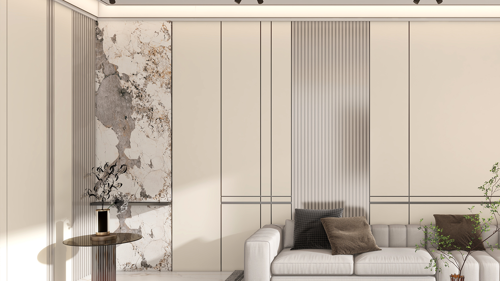
- Ivory & Beige: Warm and soft, these hues relax the eye. Often used in bedrooms, spas, and wellness zones.
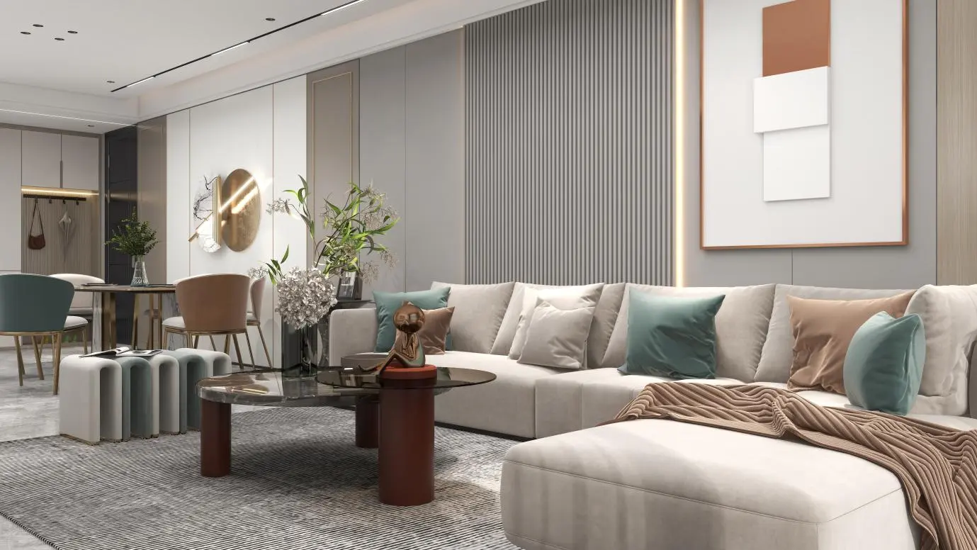
- Gray: Modern and versatile, it pairs beautifully with metal accents. Darker grays fit business hotels, while lighter grays complement resorts.
- Taupe: A refined balance between gray and brown, commonly seen in meeting rooms and upscale restaurants.
- Classic White: Expands space visually, making it ideal for hallways and lobbies with contemporary designs.
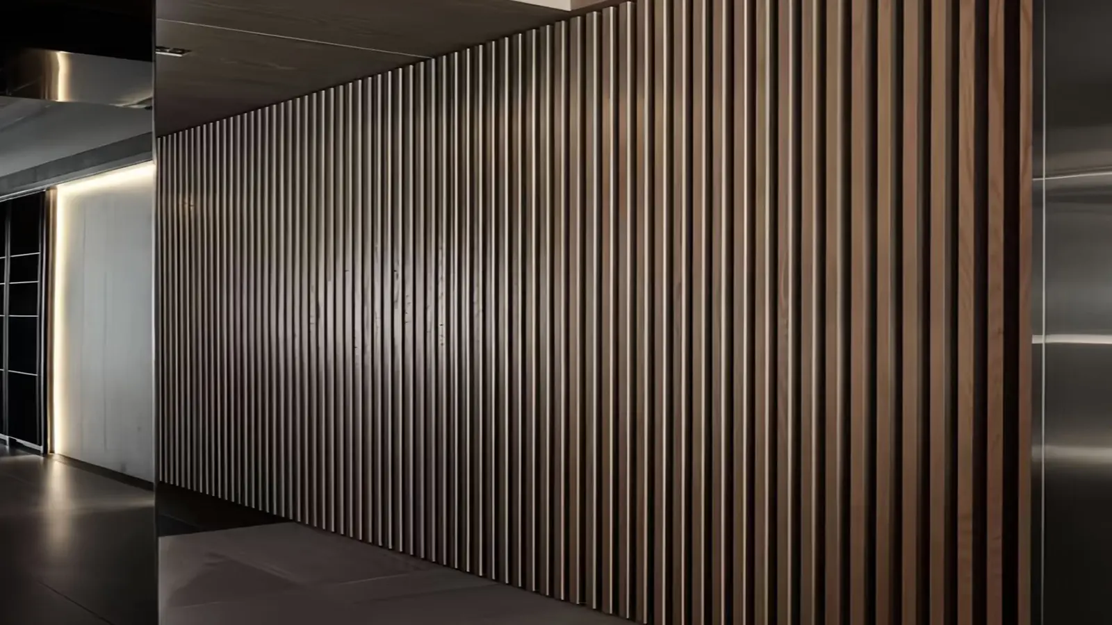
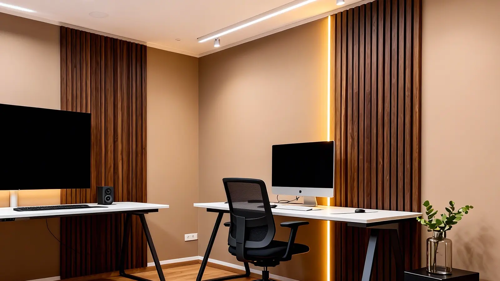
2. Wood-Inspired Finishes
Wood grains are consistently the most requested style in hotel interiors, thanks to their warmth and authenticity.
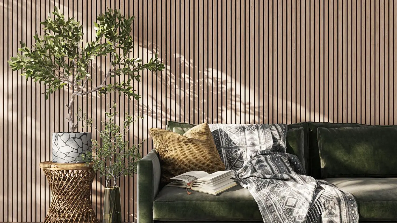
- Light Oak: Fresh and minimal, perfect for boutique or Scandinavian-inspired hotels.
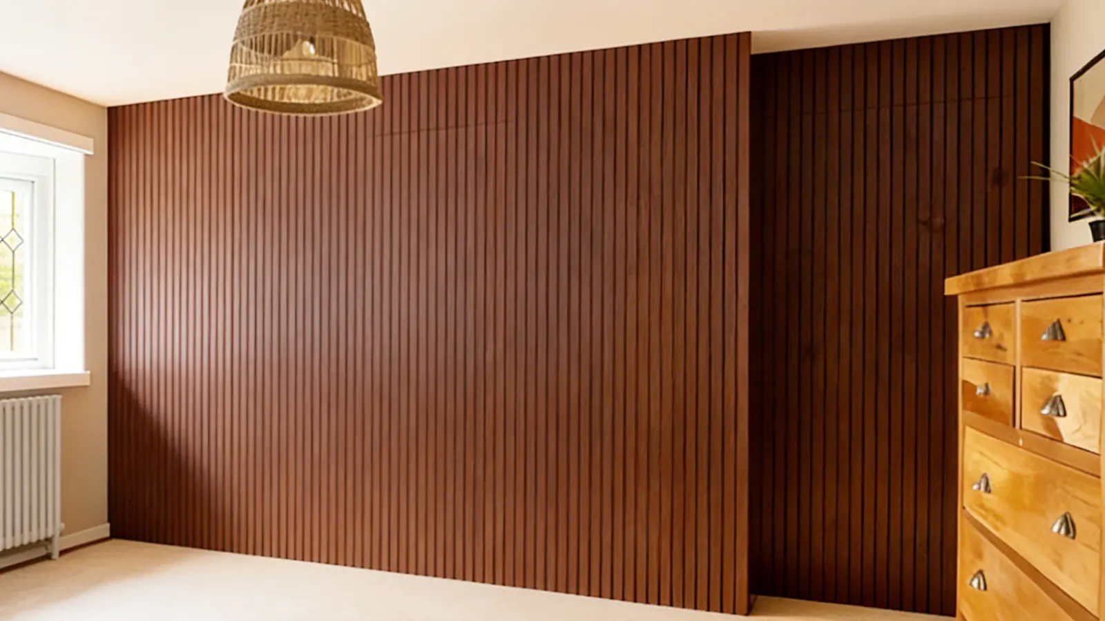
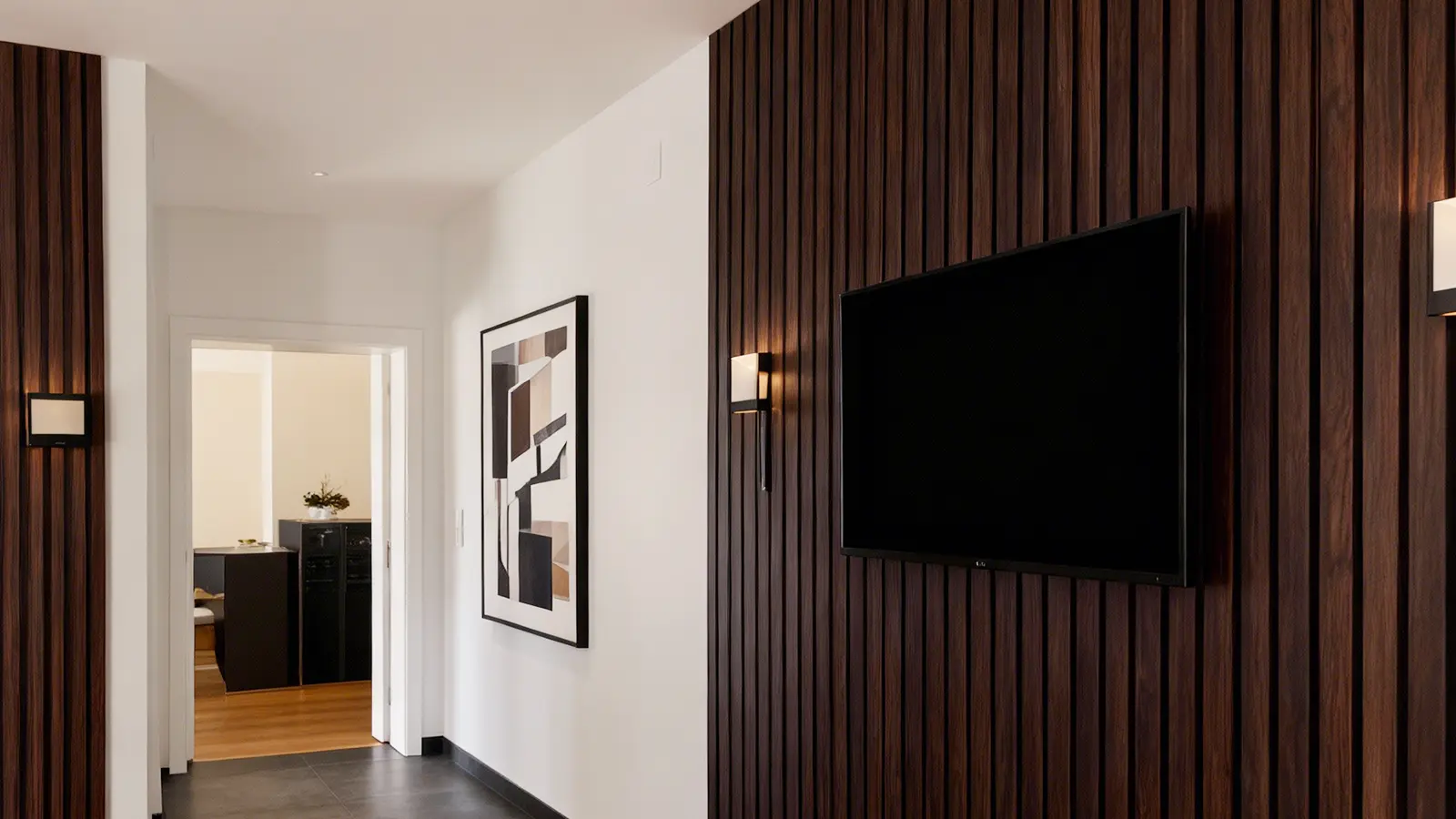
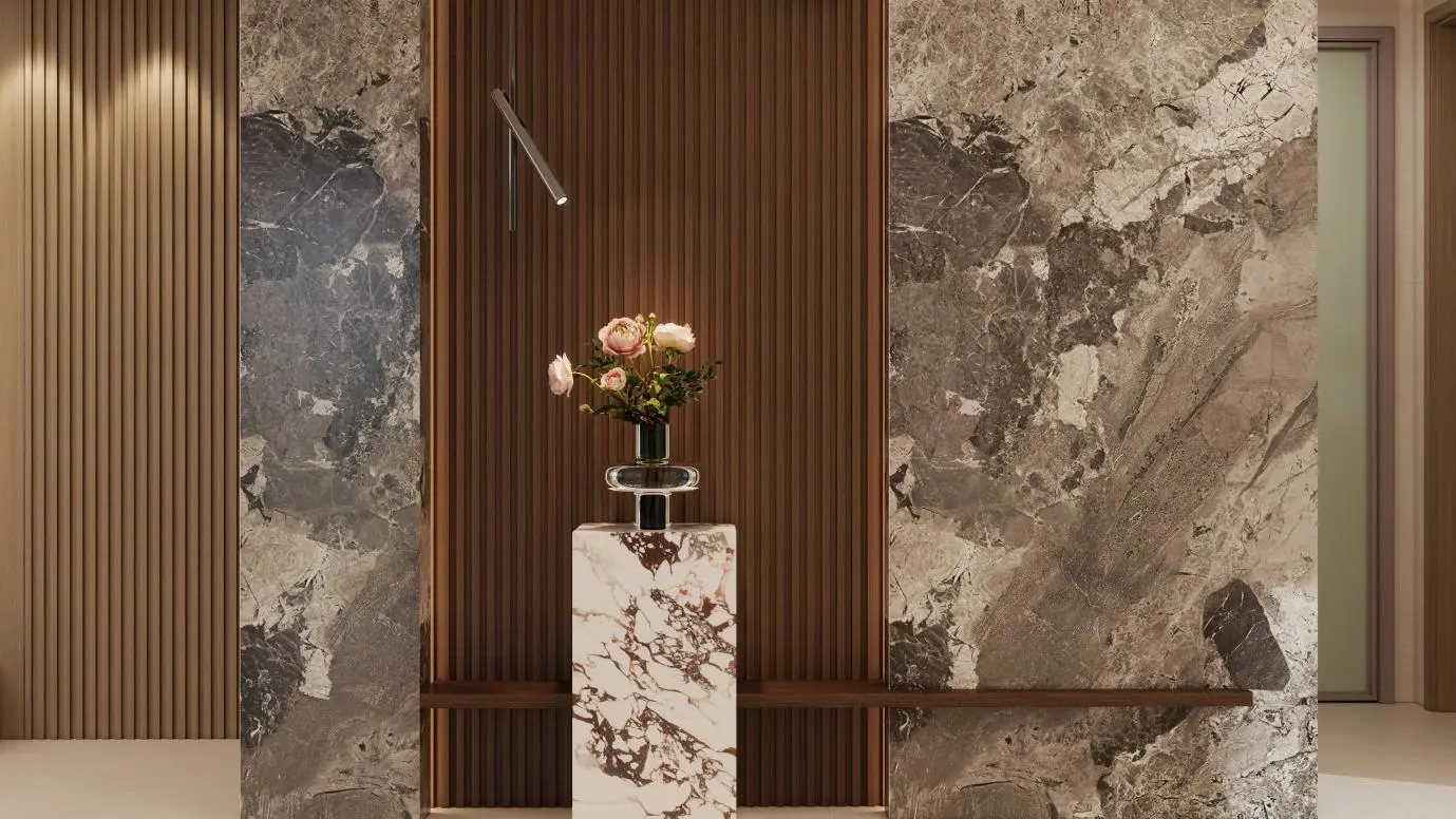
- Walnut: Dark, rich tones lend a premium feel to executive suites and main entrances.
- Ash Wood: Slightly gray undertones give it a modern, sleek aesthetic.
- Teak: A golden shade that balances elegance with natural charm, often used in dining spaces.
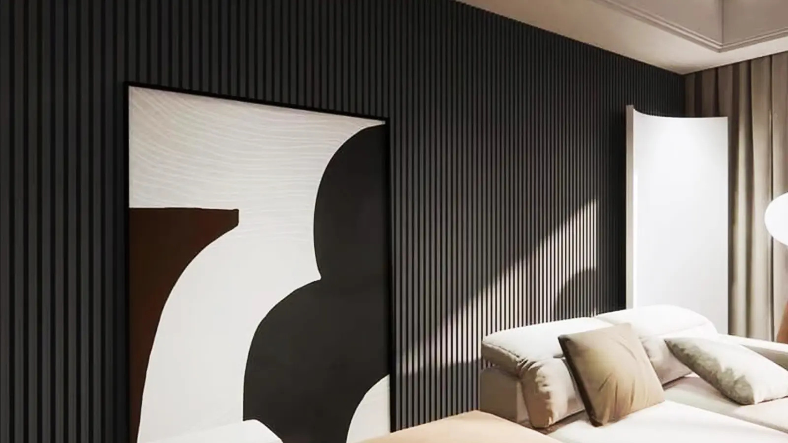
3. Dark and Dramatic Shades
Sophisticated hotels often rely on deep colors to create contrast and exclusivity.
- Espresso Brown: A luxurious shade suitable for fine dining areas and elite lounges.
- Charcoal Gray: Striking and bold, typically combined with gold accents for a contemporary edge.
- Black Wood Grain: A daring choice, frequently applied in boutique hotels, bars, or nightlife spaces.
4. Earthy and Warm Tones
Hotels looking to provide a natural, grounded experience often turn to earthy palettes.
- Terracotta: Mediterranean-inspired reddish tones, great for resorts and coastal retreats.
- Sand Beige: Reminiscent of beaches, perfect for seaside hotels and outdoor dining spaces.
- Olive Brown: Brings nature indoors, pairing well with greenery in eco-resorts.
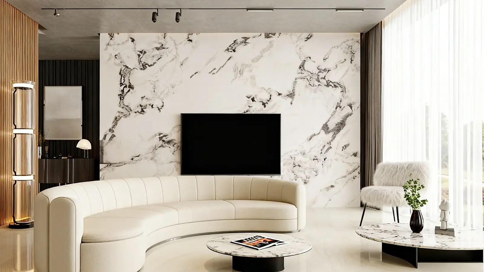
5. Contemporary Trend Colors
Newer design movements have introduced colors that reflect modern aesthetics and eco-consciousness.
- Matte Blue: Calming yet stylish, appearing frequently in boutique hotels.
- Green Variants: From sage to forest green, ideal for wellness areas and sustainability-focused projects.
- Gold-Accented Panels: Luxurious touches that highlight premium interiors.
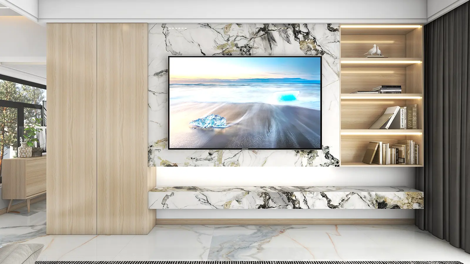
- Marble-Effect Panels: White backgrounds with gray or gold veining, mimicking natural stone while maintaining WPC’s durability.
Applying Colors in Different Hotel Areas
- Lobby: Neutral hues such as beige or taupe foster openness, while darker walnut or charcoal tones elevate prestige.
- Guest Rooms: Soft shades like oak, ivory, or light ash create a cozy, restful retreat.
- Dining Areas: Rich woods or terracotta tones enhance appetite and warmth, while marble finishes add luxury.
- Conference Halls: Grays and taupes convey professionalism and focus.
- Spas & Wellness Zones: Sage greens, beige, and ivory harmonize with nature-inspired designs.
Global Preferences for WPC Panel Colors
- Europe: Minimalist palettes dominate, with oak, ash, white, and gray frequently seen in Scandinavian-style projects.
- North America: Dark walnut, espresso finishes, and marble-inspired designs are preferred for upscale hotels and business venues.
- Middle East: Hotels favor opulence with golden accents, beige tones, and deep wood shades.
- Asia-Pacific: A mix of modern and traditional, with teak, walnut, and neutral light colors shaping regional hospitality design.
Choosing the Right Palette for Your Hotel Project
When selecting panel colors, hotel owners and designers should weigh several considerations:
- Brand Positioning: Luxury brands often select bold, dark palettes; eco-friendly resorts lean toward greens and earthy tones.
- Target Demographics: Younger audiences enjoy modern colors like matte blue, while business travelers prefer neutral professionalism.
- Lighting Conditions: Natural daylight and artificial lighting can alter the perception of color dramatically.
- Timelessness: Neutral and wood finishes ensure longevity, while trend-based tones may need periodic updating.
Conclusion
The color palette of WPC wall panels plays a decisive role in hotel design, shaping not only visual appeal but also emotional atmosphere. Whether through the elegance of walnut, the versatility of gray, or the freshness of light oak, panel colors help establish the unique identity of a hotel.
Today’s hotels must balance tradition with innovation: neutral and wood tones provide timeless foundations, while modern shades such as sage green, marble effects, and gold accents reflect evolving design trends. By thoughtfully integrating WPC wall panel colors into different functional areas, hoteliers can create interiors that resonate with their brand story, enhance guest satisfaction, and ensure long-term design relevance in an ever-competitive market.
At RUIDE, we are committed to delivering WPC wall panels that not only meet global standards but also bring lasting beauty and value to every space. To let you experience the quality firsthand, we are now offering free samples. Simply request yours today and discover how RUIDE WPC panels can transform your home or commercial project with style and durability.