From Subtle Neutrals to Bold Color Statements — What’s Trending in PVC Marble Sheets in 2025
From Subtle Neutrals to Bold Color Statements — What’s Trending in PVC Marble Sheets in 2025
Table of Contents
- Executive Summary
- Setting the Scene: Why Color Choices Matter in PVC Marble
- Dominant Color Families: Why They Lead
- Growth Segments: Where Bold Colors Gain Traction
- Visual Effects & Design Details That Amplify Color
- Key Drivers Behind Color Popularity
- Strategic Takeaways for Brands, Designers & Retailers
- Conclusion
Executive Summary
As interior trends evolve, PVC marble sheets (frequently UV-coated) have matured from novelty alternatives to central design elements. While neutral colors retain mass appeal, daring hues and dramatic veining are carving out a growing niche. This article analyzes the dominant and emerging color trends in the PVC marble market, deciphers the forces behind their popularity, and offers guidance for designers or brand owners to ride these shifts confidently.
1. Setting the Scene: Why Color Choices Matter in PVC Marble
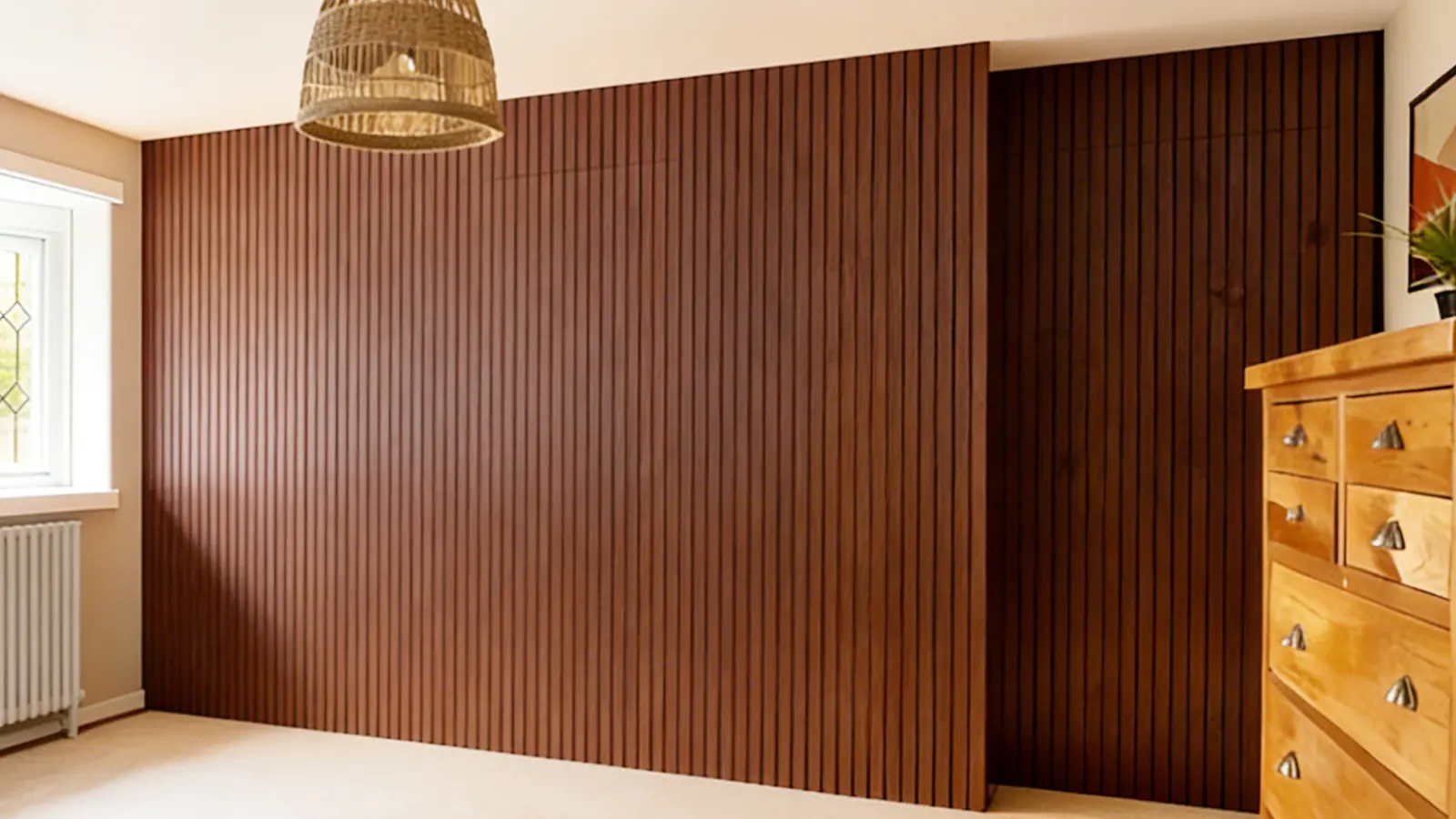
When a wall, countertop, or accent panel features a PVC uv marble sheet, the eye is immediately drawn to color and texture. Unlike plain paint or solid-surface panels, the visual complexity of marble — its background tone and veins — significantly influences spatial perception. Hence, selecting the right “color family” is as strategic as structural choice.
PVC marble sheets marry appearance and practicality: they mimic real stone while offering benefits like moisture resistance, light weight, and lower installation cost. Because of this, they’re increasingly considered first-choice materials rather than afterthoughts in many projects.
2. Dominant Color Families: Why They Lead
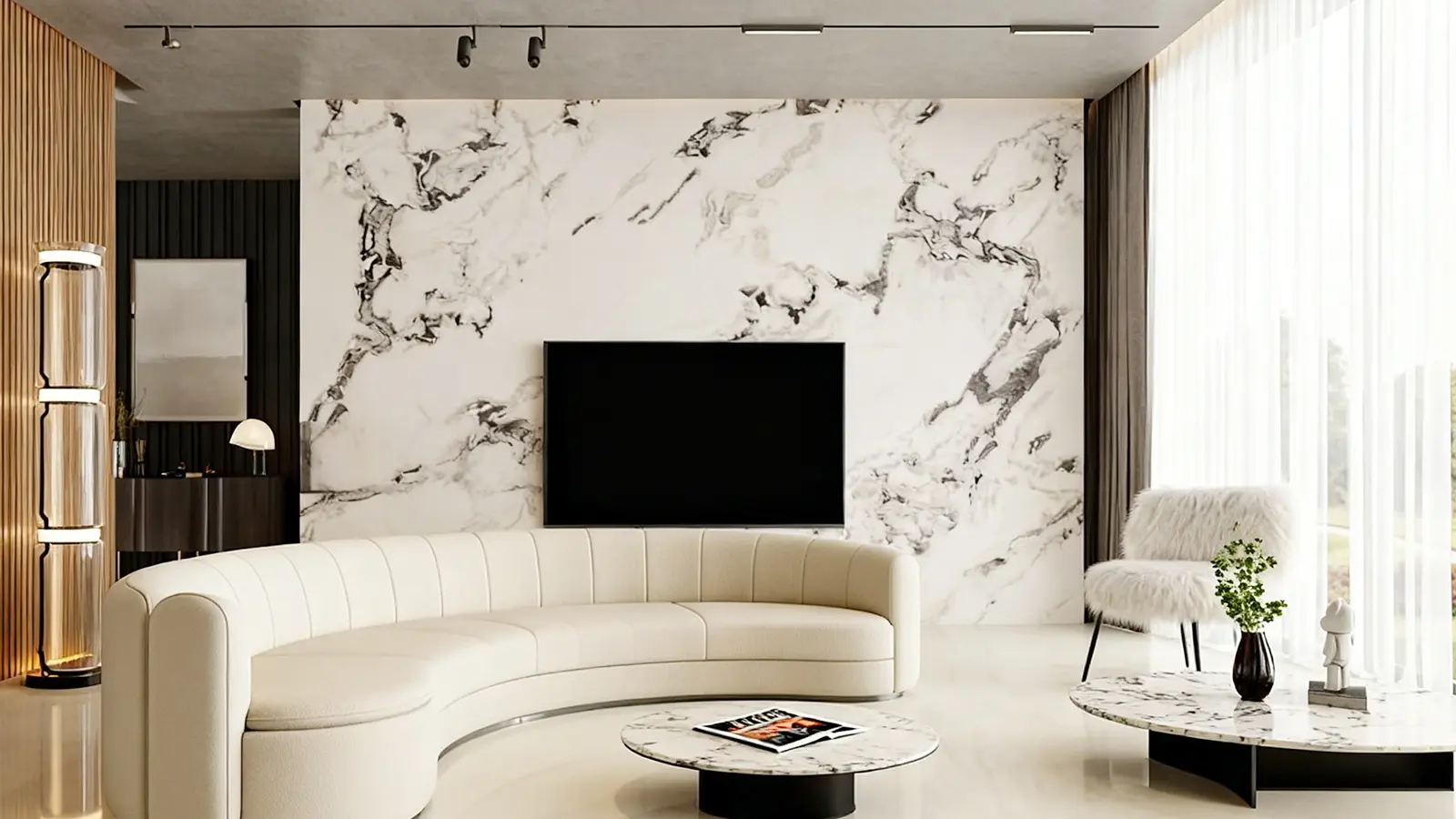
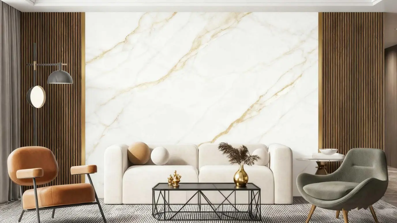
2.1 White Variants (Soft to Bright)
White remains the gold standard. Within that, designers differentiate among multiple whites:
- Soft white with faint veins: understated and subtle
- Bright white with high-contrast veins: modern and crisp
These options allow consistency across different lighting conditions. White variants remain regular stock in catalogs and are often the default recommendation in project briefs.
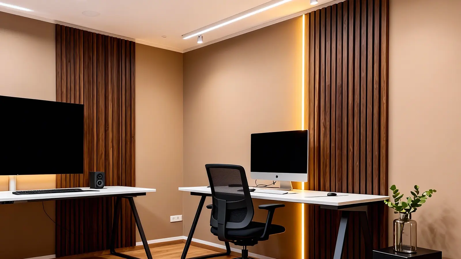
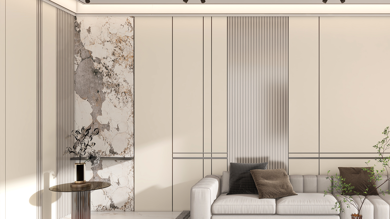
2.2 Warm Neutrals: Beige, Ivory & Cream
In the past few years, we’ve noticed rising demand for warmer neutrals. These hues reduce the starkness of pure white and harmonize with earthy materials like wood or brass. In many trend articles (e.g. UV marble design trends for 2025), warm tones are listed among top picks.
Such neutrals are preferred in hospitality, residential interiors, and public spaces seeking an inviting yet elegant ambiance.
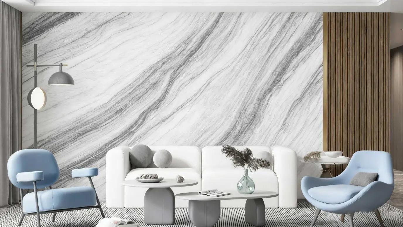
2.3 Gray & Greyscale
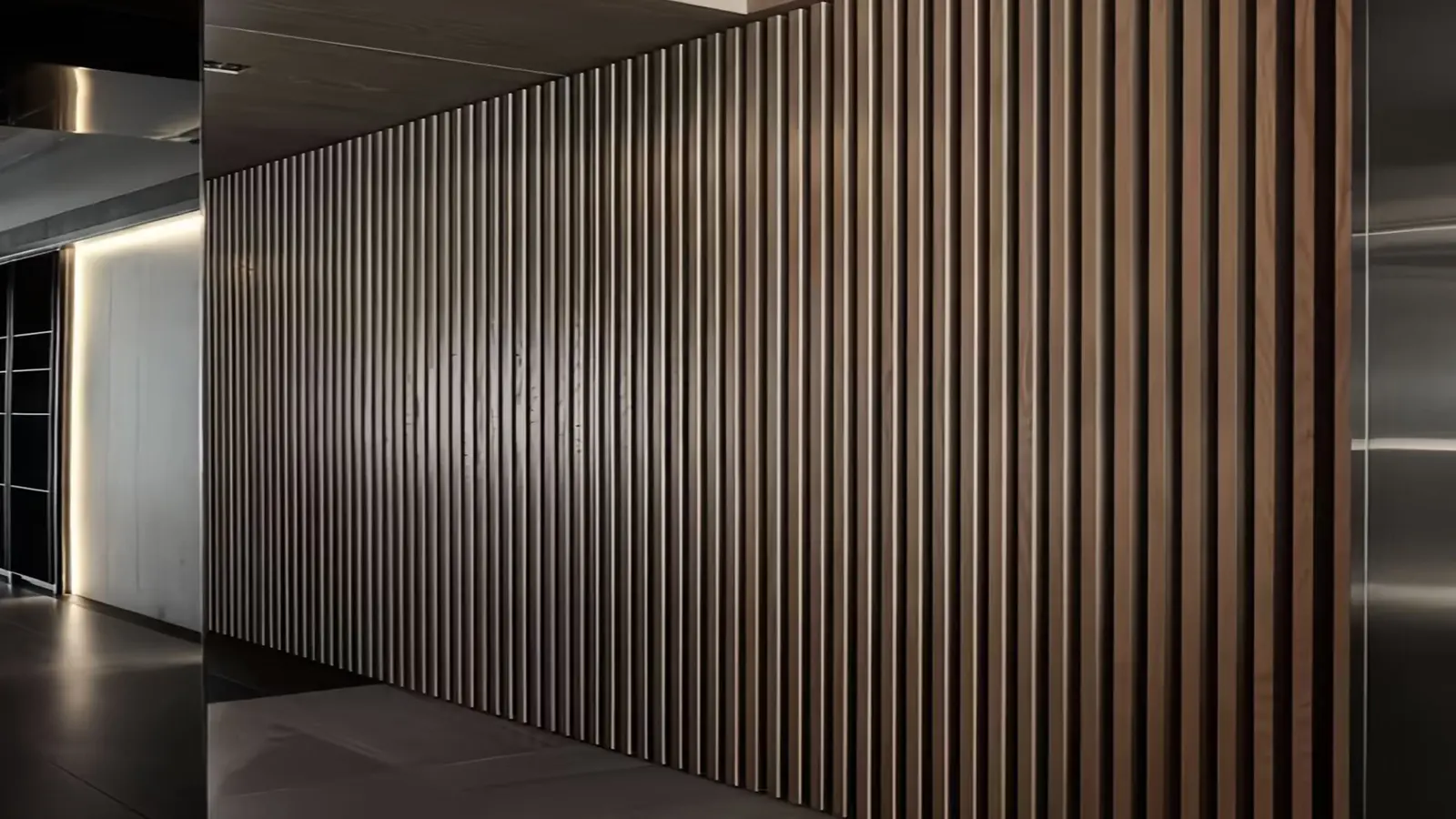
Gray is the “neutral’s neutral.” Light gray, greige, and charcoal panels occupy the middle ground between warmth and coolness. They pair effortlessly with City / loft / industrial aesthetics. In PVC marble catalogs, gray options are almost always present.
Gray also helps mask imperfections or variations between sheets under varied lighting.
3. Growth Segments: Where Bold Colors Gain Traction
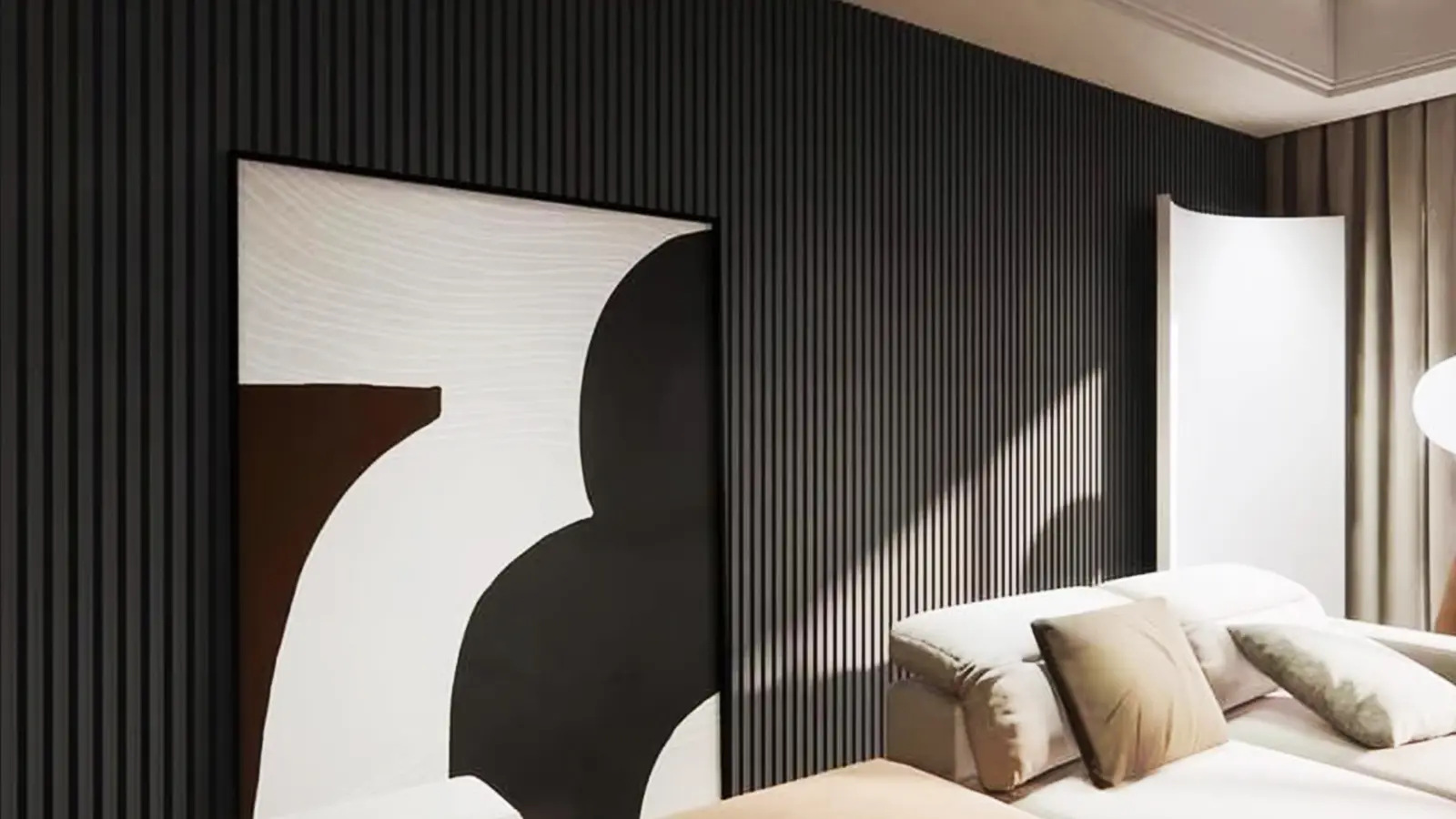
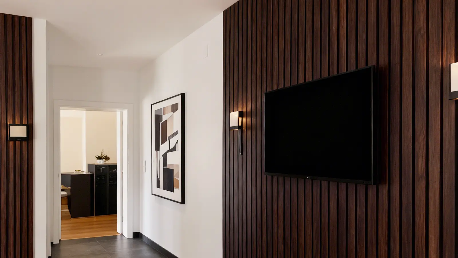
3.1 Black Marble: High-Contrast Luxury
In commercial and upscale residential design, black marble panels with striking white or gold veins are now a reliable tool to create contrast and drama. Used judiciously, they can become artistic focal points without overwhelming a space.
Because dark bases absorb light, lighting design must accompany black marble installations to avoid gloom.
3.2 Green & Teal Series
Green marble tones (emerald, forest green, jade-like) are increasingly used in boutique hotels, spas, and wellness areas. The idea: channel natural serenity into built environment design.
Teal or muted blue-green marble motifs are occasionally used for accent walls in luxury homes or creative offices. While still niche, they represent a direction toward more expressive marble flooring/paneling.
3.3 Metallic Veining & Mixed Hues
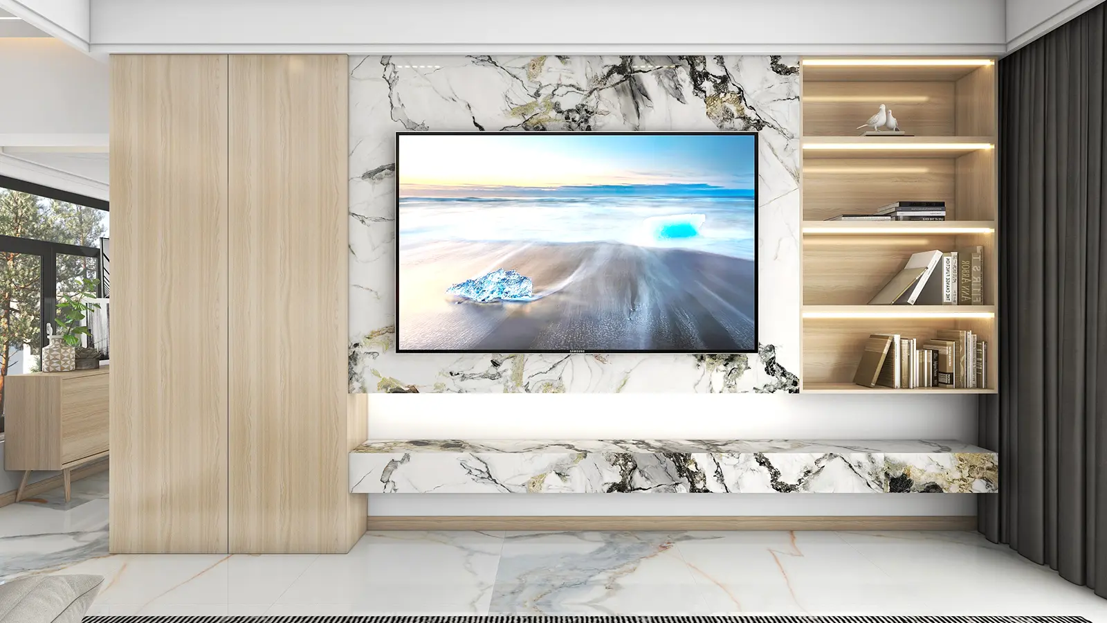
An emerging subtrend: marble panels with integrated metallic veins (gold, bronze) or multi-tone paths (e.g. white + rose gold streaks). These blends appeal to luxury retail, boutiques, and statement interiors where conventional marble would be too conservative. Bold veining is a cross-cutting design trend influencing stone, Wall Panels, and furniture.
In advanced 3D PVC marble lines, subtle relief textures and depth play into the color effect — the veining can “pop” visually even from a distance.
4. Visual Effects & Design Details That Amplify Color
- Vein contrast and thickness: Thin, light-gray veins lean calming; thick, dark or metallic veins emphasize drama.
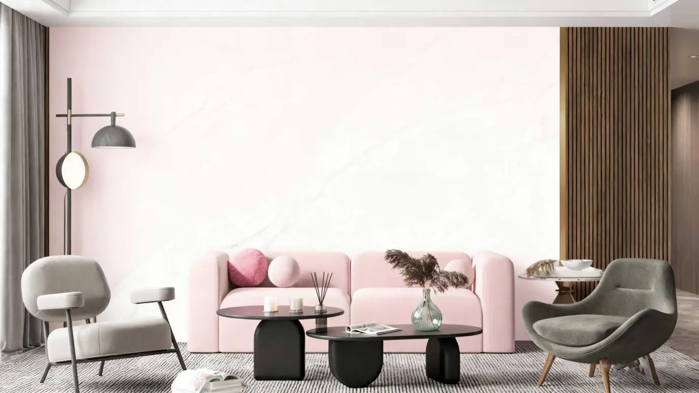
- Color gradation / fades: Some panels softly transition from one shade to another — e.g. white blending into soft beige — creating more dynamic visuals.
- Finishes: Polished gloss, soft matte, or satin finishes all influence how the color is perceived under lighting.
- Matching across sheets: Many factories produce multiple tone grades (light, mid, dark) for the same marble pattern to help designers balance light/dark interplay in different walls.
5. Key Drivers Behind Color Popularity
5.1 Timelessness & Versatility
Neutral colors maintain relevance across evolving trends. A white or beige marble wall will likely stay in style far longer than a saturated blue-green one.
5.2 Lighting & Spatial Perception
Lighter panels help brighten and enlarge spaces. Darker or bold panels require careful lighting design. Many designers choose lighter neutrals for majority areas, reserving bold panels for accents.
5.3 Inventory & Costs
Mass-produced neutrals enjoy economies of scale — lower costs, faster delivery, consistent stock. Bold or custom colors often carry premiums and longer lead times.
5.4 Differentiation & Brand Strategy
Commercial clients, hotels, and retail brands may seek unique marble identities to distinguish their spaces. That drives demand for customized hues, veining styles, or signature color treatments.
5.5 Trend Influence
Interior trends (minimalism, biophilic design, bold statement interiors) feed into what colors people want. As bold veining and color accents become more accepted in mainstream design, the market for expressive marble panels expands.
6. Strategic Takeaways for Brands, Designers & Retailers
- Offer tiered color lines: Keep a robust set of neutral / high-volume colors, plus a premium “expressive” line of bold hues or metallic veining.
- Promote tone variants: For a given marble pattern, supply light/medium/dark options to adapt to different room luminance.
- Balance bold with restraint: Use statement panels sparingly in critical focal areas, not entire rooms.
- Integrate lighting in planning: Bold colors require accent lighting; neutrals benefit from diffuse lighting.
- Visual marketing: Show real-world scenes (bathrooms, lobbies) where bold panels are used as accent walls — helps clients envision context rather than abstract slabs.
Conclusion
In 2025, PVC marble sheets continue to be dominated by white, beige, and light-to-medium grays — favored for their timelessness, adaptability, and supply advantages. However, a growing niche exists for dark, saturated, and metallic-accented panels used judiciously as focal points. For brands or designers entering or expanding in this market, adopting a dual-track strategy (neutrals + expressive lines) and emphasizing lighting-aware design will position you to ride both mainstream and creative waves.